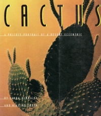
 I bought this book in October to browse during football games. Unfortunately, it was not meant to be: although this is a book of photography, it wouldn’t do for browsing during a football game because the paragraphs of captions and philosophizing about cacti are in a script typeface, which makes them hard to read. You have to follow along very carefully and can’t jump right back to a place after a football play.
And the photos include a few landscapes with cactus, but with camera and development effects/filters, especially underexposure to darken everything. But most of the photos are close-ups focusing on color and texture. Combined with the script font, this is a design book more than a photography book. Look at how pretty the book is except for the content.
So I was underwhelmed.
I was pleased with knowing who Pavlova is in this caption, though:
Rhythm, light, and balance, like Brancusi and Bach and Pavlova at once.
I know who Anna Pavlova was because I’m well read, and part of that reading is Neo.
So, meh. But it’s off the side table.