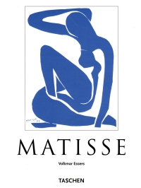
 I bought this book a couple of weeks ago and delved right into it. I hoped it would be a football browser, albeit something I could browse during night games to hopefully not expose the nude model photographed on the back to my children. But it turns out this book has a lot of text that includes not only biographical information about Matisse and a broad discussion of his artwork as it relates to trends in the art world and whatnot but also lush descriptions of the images that explain why the images are awesome.
Text like this:
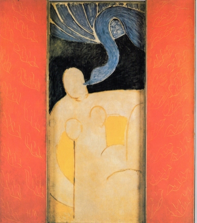
In 1944 the Argentinian diplomat Enchorrena, who was resident in Paris, commissioned a door to connect his bedroom and bathroom. Initially Matisse opted to present an idyllic theme: a nymph sleeping, observed by a faun. But both subject and composition left the artist dissatisfied, and his work was a trial to him and stagnated. The diplomat persisted, and Matisse tried again. He chose a new subject, and this time succeeded. The mythological ‘Leda and the Swan’ (p. 82) has been stripped of all narrative content. Jupiter, who according to the myth came to Leda in the form of a swan, can be seen in the upper part of the picture, his arabesquely curved neck and head bending across a black space to Leda, who turns away. The monumental female nude has been fashioned sparingly and vastly. The empathetic, streamlined figure has something heroic, and restores the dignity to the myth. To right and left, red panels with a leaf design provied the triptych’s frame and give Matisse’s interpretation a revelatory flavor.
Which describes this:
The text contains a lot of art criticky words about the colors (the subtitle of this book is “Master of Colour”), flattening of the foreground, the additional complexity of the patterns when a table is turned in perspective in an otherwise flattened picture, and the wonderfulness of simple geographic patterns (sometimes repeated!).
But, come on. This stuff is insipid and stupid.
I have mentioned that that I don’t grok primitive art, and I really, really don’t care for the early 20th century’s descent into simplistic, unrefined brushstrokes as art. I mean, looking at a lot of this, I conclude that individual choices in the strokes, lines, and coloring doesn’t really matter. If that crescent had been an inch to the right, what difference would it make? My beautiful wife said she could probably not do better, but I don’t think she could do worse, and she and I are not fine artists with devotees and collectors and some influence (for some reason).
I’m starting to wonder if my beloved Impressionists, even the good ones (Renoir, Manet, Cassatt, and I suppose Monet) irretrievably broke art when they diminished the reliance on clean lines. The bad ones (Degas, Toulouse-Lautrec, and so one) might have led to Cubism and whatever ism Matisse is. In celebration of the hundredth anniversary of World War I, a lot of commentators told us that the war broke Western civilization. Looking at Matisse, I expect the cracks were already there.
So don’t expect to see Matisse prints at Nogglestead nor any other monographs of his work reported on in these pages. A Good Book Hunting post from 2015 indicates that I have another Matisse title around here somewhere, it might be akin to What Makes A Picasso A Picasso?–that is, a children’s book. So that might be the exception–I’ll certainly not buy another Matisse monograph.
Oh, and since this the Internet, I know you’re all jonesing for the back cover. I’ve put it below the fold.
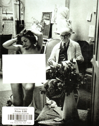
The inscription on the title page, written when this book was initially a gift from Tammie to Rita, says “You might need a ‘Post-It’ for the back of this book!” I should have thought of it myself before I scanned it for you, gentle reader, so I could have read it slightly less furtively in my own home.
