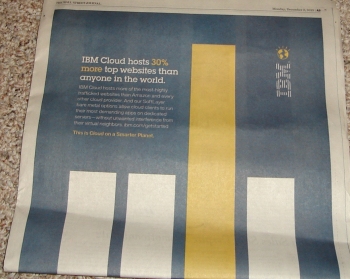
Spotted in the Wall Street Journal, a friendly message from IBM:

Friends, if you don’t think some junior-level creative was snickering in his or her sleeve when he or she came up with this design, you have not worked with junior-level creatives.
I mean, it’s supposed to be a bar chart showing that IBM Cloud hosts 30% more of something. One could have designed an ad where the bars were of differing heights because IBM hosts 30% more than its nearest competitor (not all competitors who are tied). They could have put the IBM bar at the end. They could have made the IBM bar be, you know, 30% taller than the others (the bars extend some distance below the fold, which means the middle finger bar is not actually proportionate to the numbers claimed in the copy).
Which is why, in the olden days when I worked at an interactive agency, I had to keep my mind in the gutter.


